I don’t think many people started out designing like a pro. If you know of someone whose work was immaculate from the start, please let me know. I’d like to personally congratulate that person for being awesome.
No, most of us have no idea what we’re doing in the beginning, and our “work” reflects that. The funny part is that we actually sort of think it’s good (at least I did). It’s only in hindsight do we see just how wrong we were.
Here’s a great example of something that will never not be funny to me:
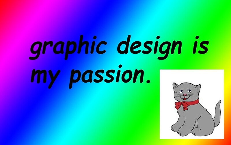
Clearly.
Lol, now I’m laughing again. It’s just such a perfect example of irony (and NO! I didn’t design it!).
No worries, I will provide examples of my own work in this article for your amusement. I’m pretty sure whoever made that did it as a gag, but if not, God help us.
Of course, someone who isn’t a designer may not pick up on why the image above is so funny, but once you understand, it becomes an instant classic. The only thing that would have made it better is if the text had a stroke on it. LOL. #graphicdesignerhumour
My work wasn’t that bad, but it was getting there.
Phase 1 – Super Noob Status Initiated
I remember when I was going to Wake Tech back around 2007-2008. At that time, I had to drive darn near an hour just to get to the main campus. One of my teachers was a lady by the name of Marsha Mills.
Marsha and I had our ups and downs, but I think for the most part she was fond of me and thought I was cute. I thought she was attractive as well. Don’t tell her! Back then I was a lot more immature, and in hindsight, I can totally understand her frustration with me.
I can just imagine what was going through her mind: “Here’s this kid with lots of potential, but he’s a clown and won’t take things seriously.”
I are clown.
I think my problem was that I wasn’t focused and driven in my 20’s. I was sort of coasting on auto-pilot. Here’s a great example illustrating my point:
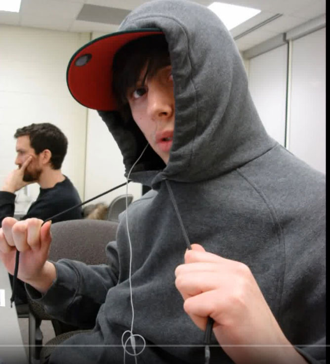
What are you doing, bro? Shouldn’t you be working like that other diligent student and not taking glamour shots by Deb? Haha. I still remember who took this photo. She was a really pretty Asian girl by the name of Hailey. I think she had a crush on me. I certainly liked her, heh. Nothing ever came of it, but we’re still friends on Facebook! She never gets on though and neither do I. Whomp.
As the classic saying goes, “If I knew then what I know now, things would be a lot different.”
My Grandma always used to say “Youth is wasted on the young.” Now that I’m 34, I get it. It’s not that I regret the past, but rather, if I had buckled down more in my younger years, or had the wisdom I have now, I’d be a lot farther along. The same goes for fitness or anything else.
I also think part of it is just the fact that not many people start as good designers. We’re ignorant. We don’t know any better (like that dope in the photo lol). It’s something that must be learned over time – through trial and error, experience, and emulating what works while avoiding what doesn’t.
I think most people fall into the “what doesn’t work” camp by default. They resort to cheap effects, the basic functionality of the program, and techniques that take very little time and effort to learn (cough outer glow cough). ‘Scuse me.
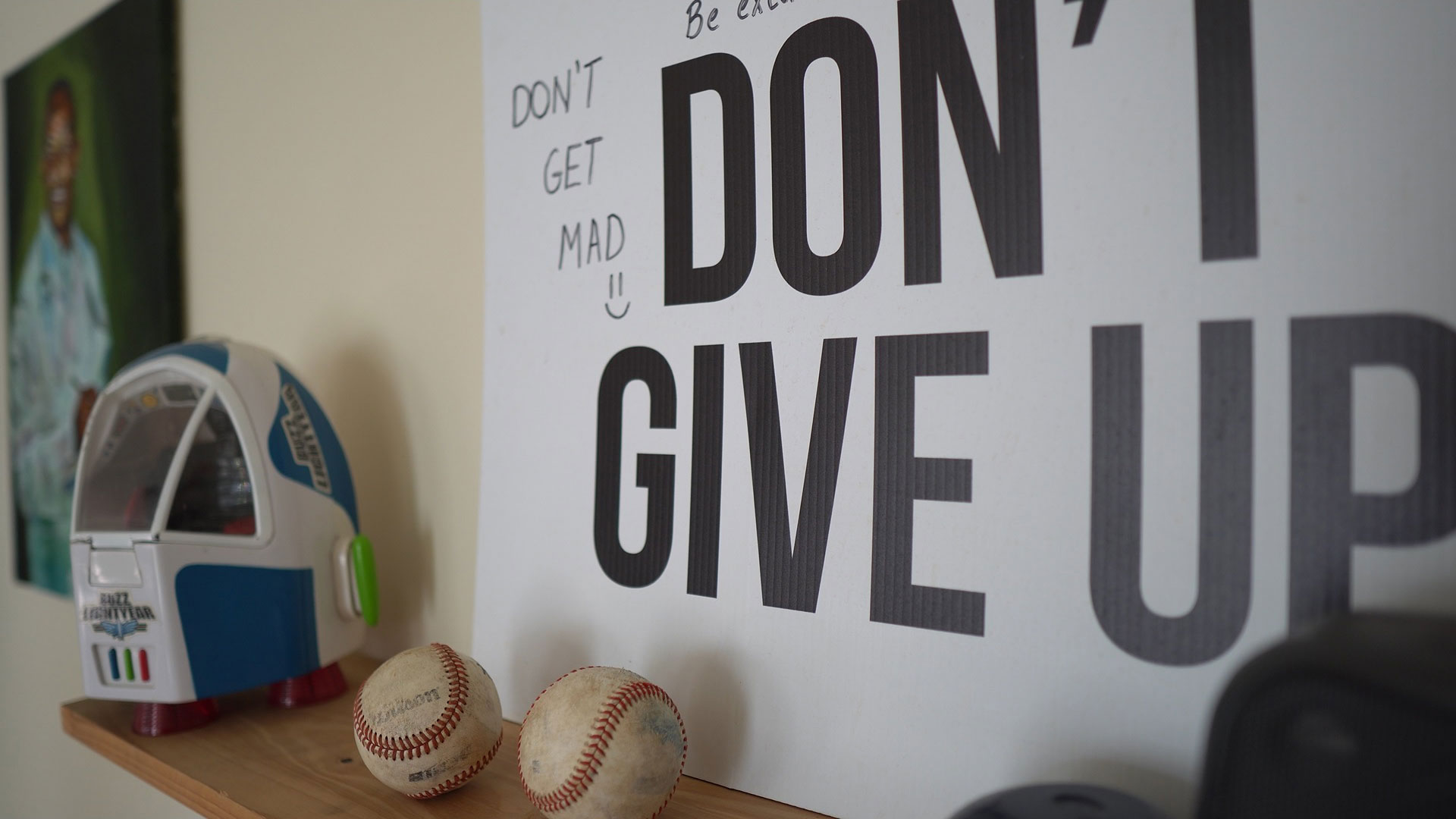
Good Graphic Design is incredibly subtle at its core; it doesn’t try to do or be too many things at once, and it’s comfortable in its skin.
Back to Marsha.
There was a design, in particular, I did that I thought was really good. To this day, I still think it’s pretty good, but every year that goes by it gets worse and worse.
Marsha knew it was bad right off the bat and told me as much. Actually, she didn’t say much of anything at first. She just kind of looked at me weirdly and gave me one of those “Why” faces.
Sort of like this:
xD
She always had that signature half-baked “What the f” smile goin’ on. Priceless.
It’s something I always appreciated about her. She was deadpan and honest with you no matter what. My mom is the same way. She’ll tell me when I look like a rag-a-muffin and when I look handsome. That’s love!
But What’s! LOVEEE got to do, got to do with it?!?
I learned quite a bit about design from Marsha, but I wouldn’t become a good designer until years later, long after graduating from Wake Tech in 2010.
Phase 2 – Well, you’re not terrible anymore, so there’s that.
I would say one of my biggest growth spurts came during my time at WCU.
In 2010 I still didn’t know how to implement good techniques into my work, but by the time I graduated in 2013, I had a much better handle on some core typography and layout concepts – many of which I use to this day.
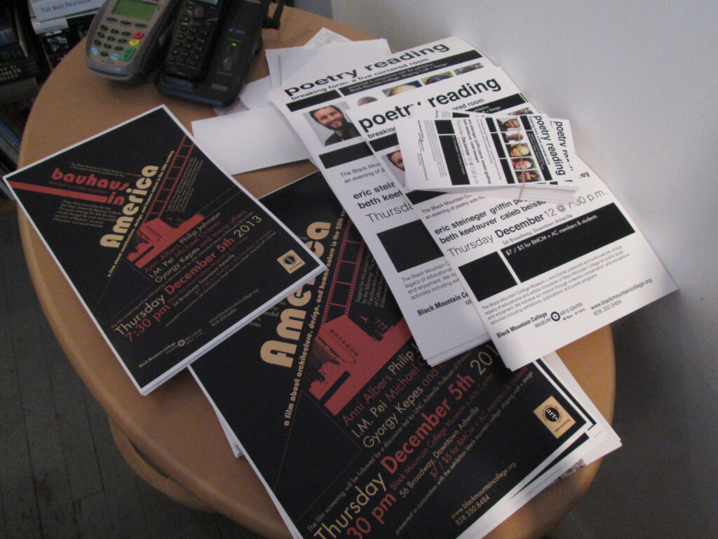
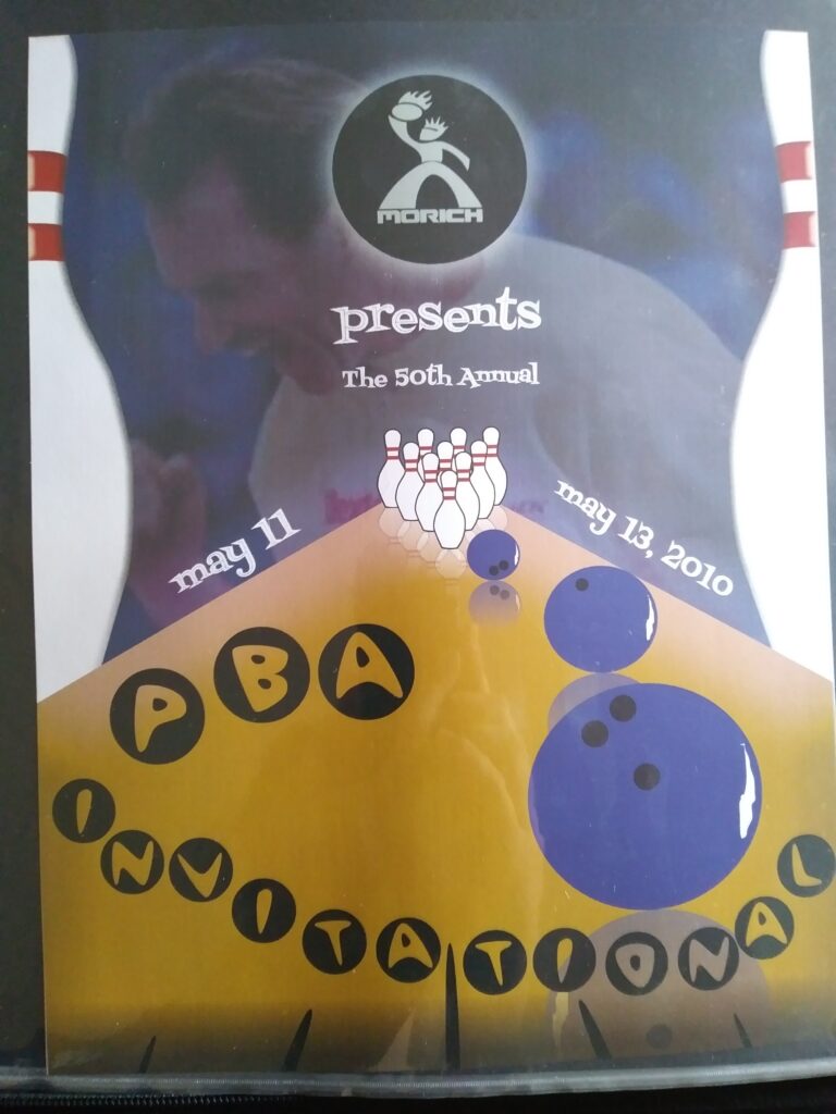
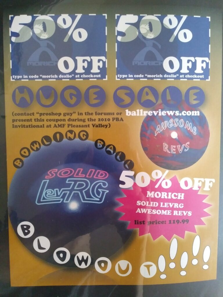
Here are a couple of examples of work I did as an intern at Black Mountain College Museum.
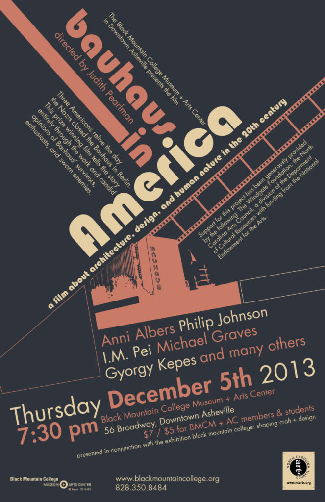
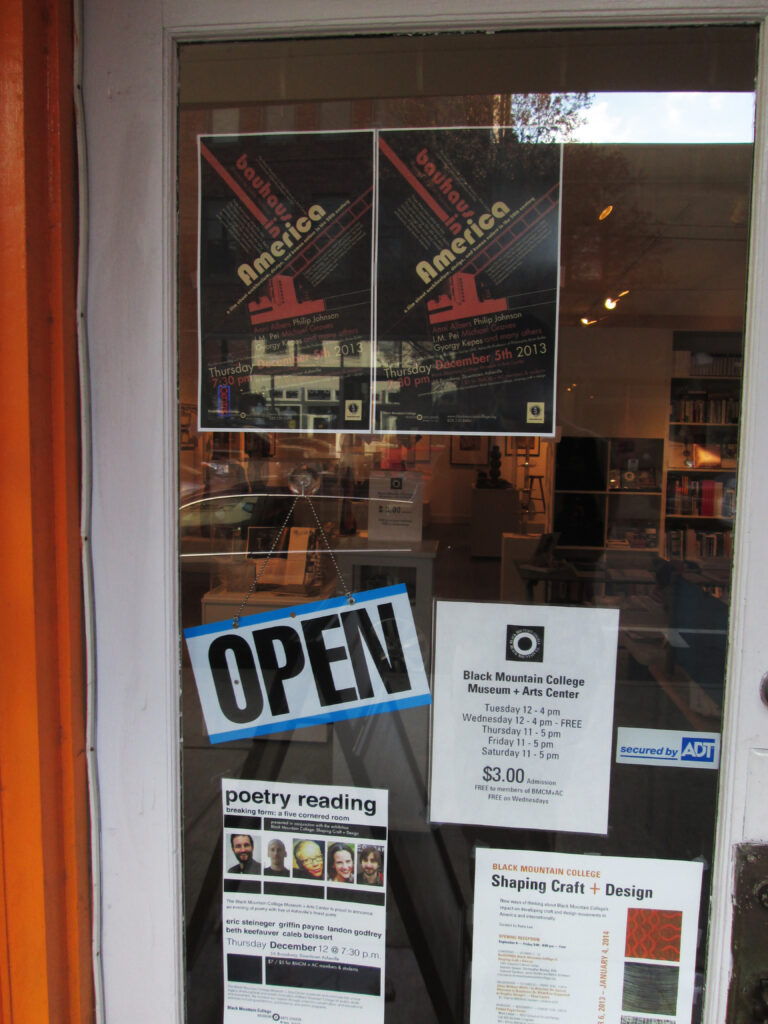
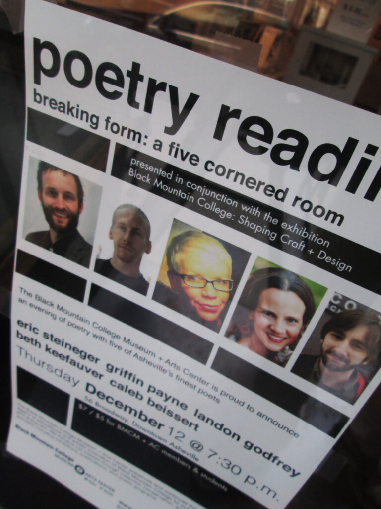
The importance of choosing a good font cannot be overstated. If there was one thing I took away from my time at Western, I think that was it. That, but also the ability to use an image in order to convey an idea.
In the example at the start, we saw what a bad one looks like. Comic Sans is just that; comical. It should pretty much never be used for anything ever.
“Yeah, I think I’ll just use comic sans.”
Said no true designer ever.
If someone claims to be a graphic designer but uses Comic Sans, your reaction should pretty much be this:
Thankfully, I pretty much never got caught in the trap of using awful fonts and acting like nothing was wrong.
PHEW!!
The only thing worse than Comic Sans is Papyrus, and don’t even get Marsha started on that one!
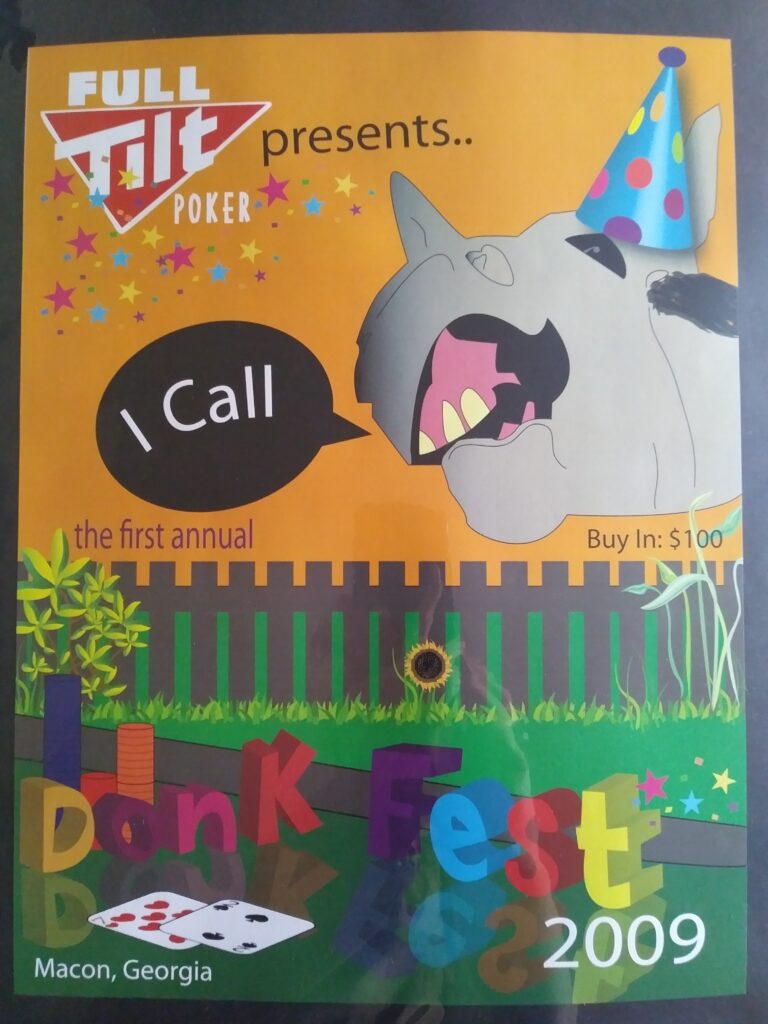
As promised, here’s the infamous design that I’m kind of embarrassed to show, let alone say I thought was good.
Bear with me, I have to go underneath my bed to dig this one out. You know, that place where no one ever goes unless they want to sneeze for the next 3 weeks?
That’s how shameful it is.
Do I have to take a picture too?
Oh yes. Yes, you do.
Now before you start laughing hysterically, let me explain.
I swear it wasn’…
I jus…
LOL.
I think people who were heavily into the online poker scene back then will undoubtedly see the humor in this, but Marsha wasn’t having it, no siree-bob.
You see, in the online world, bad players are known as “Donkeys” or the abbreviated “Donk.” It went so far that professional poker player Barry Greenstein is now famous for being heckled into saying “L-O-L Donkaments” out loud on live T.V. during a High Stakes Poker match.
The fun starts around 18:00 and he says it at 21:25
So basically the project here was to come up with a mock event and design it. Being that I was playing a lot of online poker at the time, I came up with an event called “Donk Fest 2009.” A poker tournament if you will.
The rest is history as they say.
In looking back on these old designs, I can honestly say that I think I had some good ideas with a lot of poor execution.

The Donkey in the above image is not well designed at all and looks very elementary in comparison to the other cleaner elements. My goal was to try and get that really funny look where you’re scrunching your nose up, but it didn’t really work. Like, at all. Lmao.
With the “I Call” bit, I was going for the 1-2 punch.
The reason it’s funny is that oftentimes in Texas Hold ‘Em, bad poker players will call the turn or river (the last 2 of the community cards respectively), even knowing they likely have the worst hand and either can’t win (as in the case of the river) or have extremely low odds to win (the turn).
This is in essence what I was going for – The look of “I know I suck at poker and lost this hand, but I’m going to spew my money anyways.”
These players are easy money, and ones you should always target at a poker table as you can just value bet big hands and they will simply check call you with an inferior pair of cards 99% of the time.
The joke is that those bad players are willing to gamble even knowing they are probably beaten, whereas a good player will fold a hand even though it might be incredibly difficult to do so.
Anyway, I’m rambling.
The point is that I had the heart, but not the skills.
Here are some more awful designs for your amusement:
Gosh, so many broken rules. The drop shadow, the glow, the outer stroke, the stupid fonts, the opacity, the reflection, the overcrowded layout, it’s just horrible. I do think that glow and drop shadows can be used appropriately in design (i.e. if you actually have a good reason to do it) but in this case, they were wholeheartedly abused.
Interestingly enough, I didn’t actually start developing my skills until after college.
Phase 3 – You kind of know what you’re doing, sorta.
I still didn’t really know how to use Illustrator that well, but the layout, font, and style of my work all improved tremendously.
Here are some designs from around 2014:
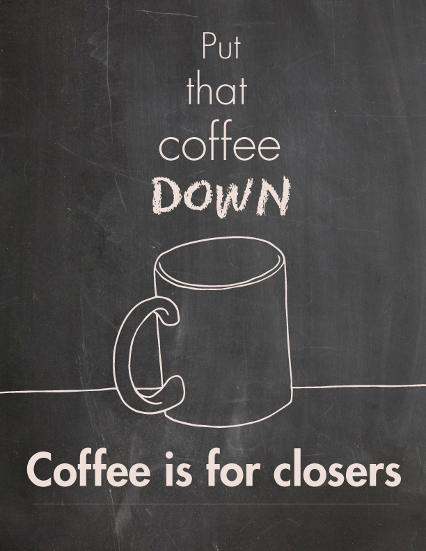
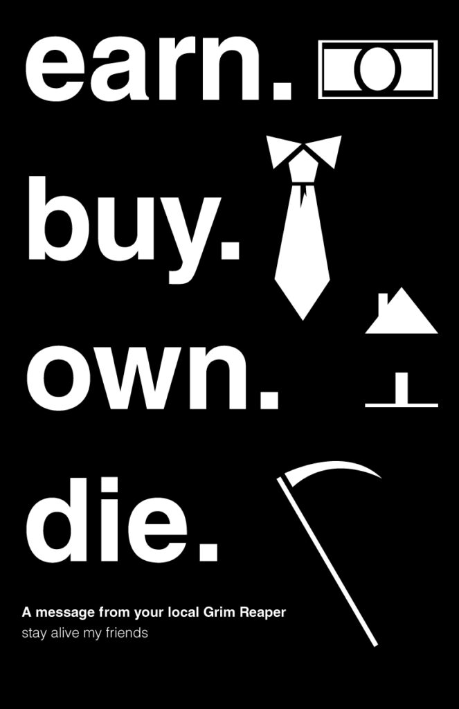
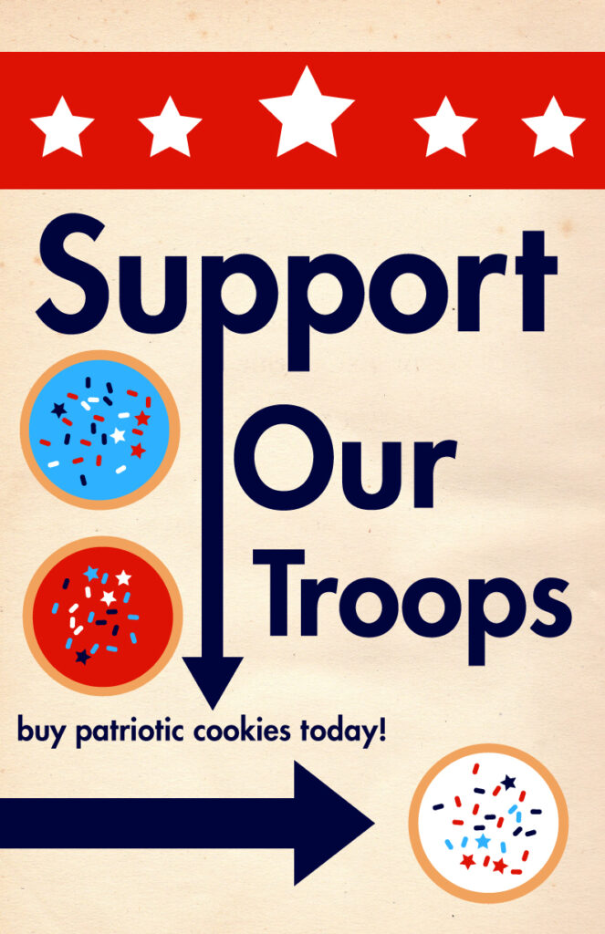

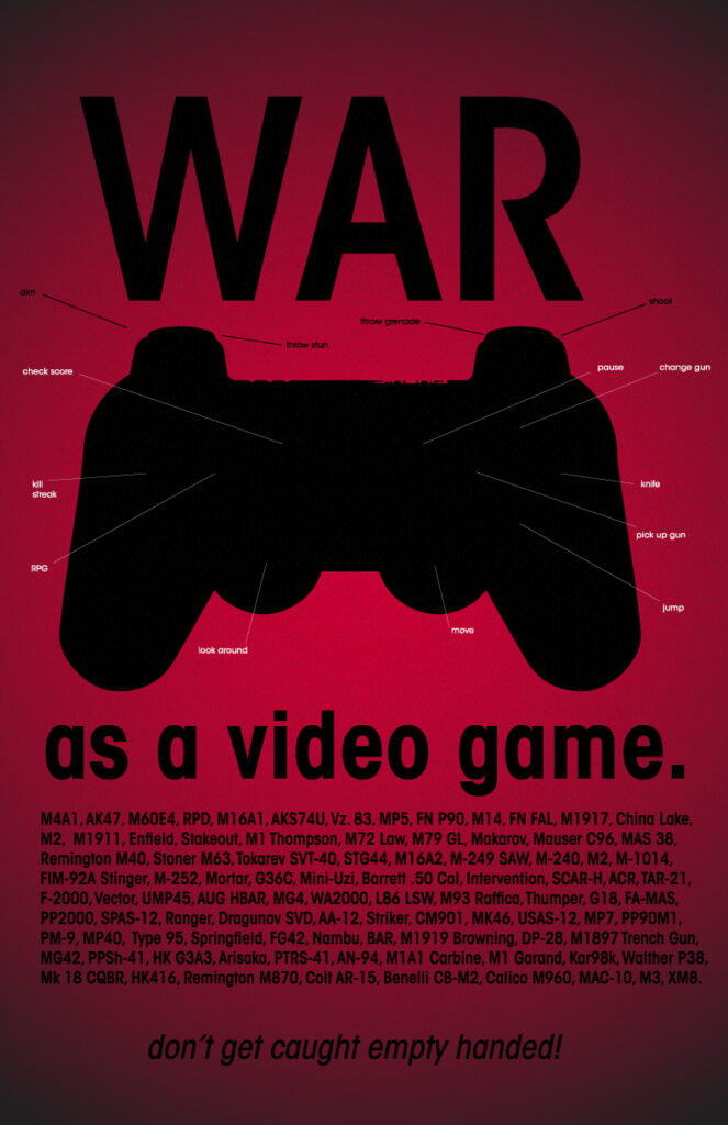
Here you can see I have some decent ideas, but at this point, I was really just experimenting with different, more serious concepts: Irony, absurdity, and tongue-in-cheek humor have always had a way of creeping into my work (whether in design, painting, or otherwise), and here it was no different.
Even so, the skill of actually using the pen tool and creating something from scratch was still lacking.
Aside from the symbols in the grim reaper image, all the rest were either hand-drawn and scanned into Illustrator, or just ripped (as in the case of the controller). I didn’t actually draw that. The cookies were drawn with the shape tool, but how hard is it to make a couple of circles and duplicate them?
What did improve in the above designs from the early days was:
- Typography. A night and day difference.
- Layout. The structure and placement of things are a lot better.
- Purpose. Aside from the movie reference in the coffee one, the others have a message and should at least make you think.
You can also see these improvements in the Black Mountain College posters.
After making these and a bunch of others, I lost my direction as far as design goes. At the time, I was fresh out of college (late 2013/early 2014) and looking for a job.
This was my way of practicing – brushing up and re-familiarizing myself with Illustrator as I revamped my portfolio and sent out my resume.
I was able to land a few interviews but always knew in the back of my mind that I wasn’t cut out for a traditional 9-5 job.
That’s a story for another day, but let’s just say that I didn’t pick up design again until around 2017 due to starting my main site HomeStudioBasics.
Phase 4 – Refining my skills (“You’re pretty good”)
Around 2017 I was writing a lot for my blog and doing a lot of marketing, but not designing or drawing anything. I felt down about it.
I grew up drawing a lot, went to college for graphic design, and earned a degree, yet I wasn’t even doing anything related. My mom helped put me through college, and I felt that I had let her down.
I decided that this time I was really going to dive in headfirst and learn as much as possible on my own, and I have! Learning how the pen tool really works, learning the pathfinder tool, working with light and shadow, illusion, 3D elements, etc.
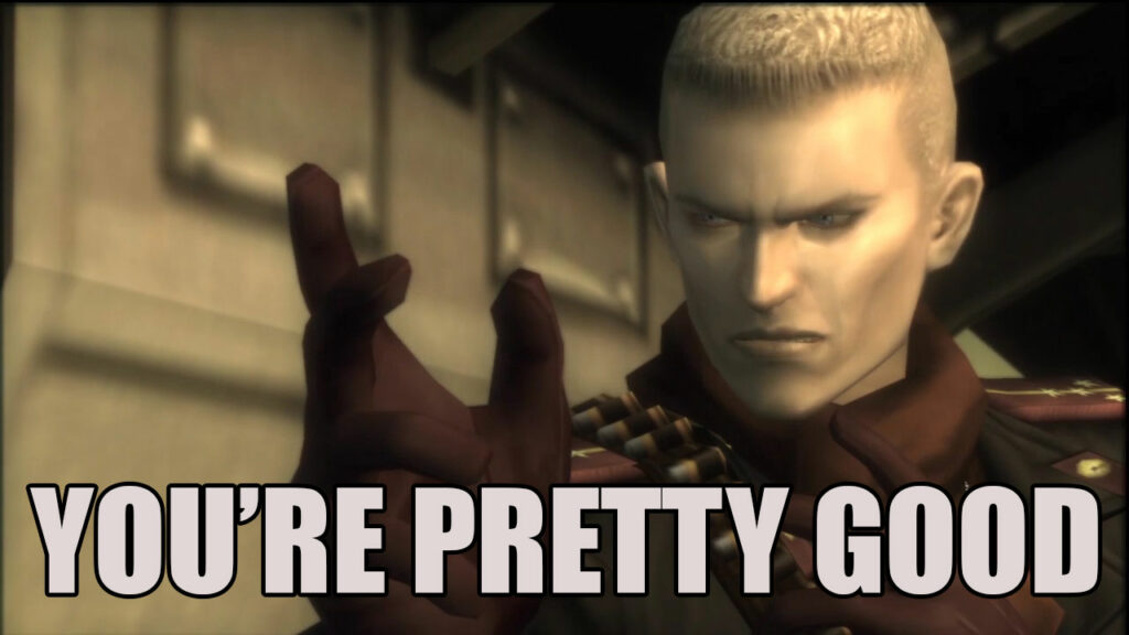
Here’s an example of a graphic that I started using for the “What’s in the box” portion of my Amp/DAC Reviews.

Solid Snake says “It’s just a box.”
As with most things in life, being a designer is a never-ending process of learning, evolving, and growing.
I feel fortunate and blessed that I get to do what I love for a living, but I also appreciate folks who recognize the work I put into it. Here’s an example:
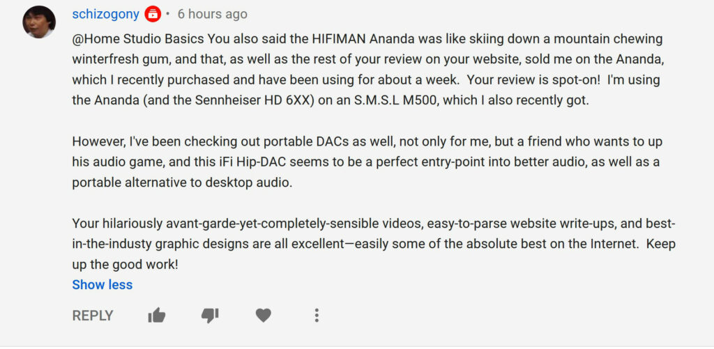
It was all so kind, but his third paragraph in particular meant a lot to me.
Today, I feel confident that I could design nearly anything inside of the program without an issue. I may look at other people’s work for reference or inspiration, but my designs are still my own. I also use tutorials when I’m either having trouble doing something or just want to learn something new. The power of the internet is truly mind-blowing.
“This is my graphic design. There are many like it, but this one is mine.”
Because my main job is to write articles for the blog and make videos for my YouTube channel, I don’t have quite as much time to dedicate to learning, but I do what I can.
What I have learned is that it’s okay not to be original, as long as you’re good. That’s a quote that I stumbled across at the MODA in 2013, and it has stuck with me to this day.
Browse my portfolio and YouTube channel (linked above). Most of my work is there, as well as on my blog.
As for Phase 5?
That’s yet to come.
Hope you enjoyed this and got a laugh or two out of it. If you have any questions, definitely reach out to me via the contact page. 🙂
If you’re interested in purchasing a print or t-shirt, check out the Shop! The price of an original painting? Contact me!
All the best and God bless,
-Stu
P.S. If you’re interested in the evolution of a cardboard box, click here: